 That's me looking for inspiration in the twisted vortex of popular culture, not for the meek, I would not suggest trying this at home.
Hierroglyphic-Frank Plant A trip through the works and musings of Barcelona based sculptor Frank Plant
Monday, December 17, 2007
Hierroglyphic/Frank Plant
Hello, my name is Frank Plant and I am an american artist based in Barcelona, Spain. I work in steel and often times am bending it into peculiar forms. Sometimes I am just welding it into normal functional things as well but I try to avoid that when possible. This blog will serve as a space that I use to document some of the projects I do as well as some of the peculiar observations I have. My friends, family, benefactors, neighbors, students, co-workers, etc., etc... will also probably knowingly or unbeknownst to them haunt these pages. I will also on occasion invent new words to see if the general population is actually paying attention and if we are on the same page. I hope that you will glean something entertaining, curious and or enlightening in these images and thoughts. So by all means read on.
 That's me looking for inspiration in the twisted vortex of popular culture, not for the meek, I would not suggest trying this at home.
That's me looking for inspiration in the twisted vortex of popular culture, not for the meek, I would not suggest trying this at home.
Wednesday, December 05, 2007
Fun on the Playground

Ainara, Steel, Cloth doll (Created by Melkorka Reynisdottir), 140cm x 60cm, 2006

Tuesday, November 20, 2007

Friday, November 09, 2007
Does your service provider make you feel your back's against the wall?

Ever hear the expression "Don't get mad get even.". This is my response to the treatment a certain spanish telecommunications service provider gives to their customers. Local regulatory commissions and the Spanish government turn a blind eye. The Spanish consumer has to look to Brussels for help as they seem the only ones to stand up and recognize the problem. The european union telecommunications regulatory commission recently slapped a certain Spanish company with a €500 million fine.
The piece involves the viewer placing on one of the gloves with the guilty company's logo printed on it. The figure in the piece has his back to the viewer and his pants around his ankles. There is a hole where his anus is, there is a red glowing from within. The viewer, with the glove on, places his finger in the anus of the figure, four centimeters in there is a button which when pressed triggers a scream (there are four tracks). This piece is a fairly direct representation of the treatment I feel the Spanish consumer gets from the local Telcomm giants. More pictures and video to come.
Wednesday, October 17, 2007
Taking it to the Banks revisiting Goya
 "When They Come Looking For Their Money (They won't care if your Vasque, Catalan, Andalusian or Gallegan)", Steel, 287cm x120cm, 2007
 Francisco de Goya y Lucientes, 3rd of May 1808 in Madrid: The Executions on Prince Pio Mountain, 268 cm x 347 cm, Oil on Canvas, 1814
 Detail of the Executioners
Friday, August 10, 2007
Sequestrados/ Hostages

Hostages, Series of 6, Steel, Mixed Media, 55cm x 20cm (each), 2007
This series has two objectives, the first was to capture in my language the desperation and the degradation that people who are sequestered are subjected to. This train of thought began from an image i saw as part of an article in the New Yorker. The article "Betrayed" by George Packer (New Yorker, 3/26/2007), is about the treatment of Iraqi's who have been playing support roles for the american army during the war there and how the american army or certain elements of it have come to make life impossible and excedingly dangerous for these people. In the article appears an absolutely gruesome and appalling image (above) of an unidentified man's body that has been left discarded on a roadside trash heap. This image haunted me and made me think about the liberties that we so often take for granted without having to fear that someone was going to drag us out of the house in the middle of the night off to the local garbage dump for a bullet in the back of the head.
 photo by Christoph Bangert
The image ingrained itself into my head almost to the point of obsession, one thing was obvious I wanted to work with the image. I scanned the image and did a drawing and at the moment it's still in progress but you can see it in it's current state below. I like it's current representation beacause it's not immediately evident what it is and hence the viewer has to work a bit to determine the material.

work in progress, steel, jute
From this point of departure I continued to develop my line of thinking but limit it to people being sequestered not assassinated. It's all to often that when the news roles around we are confronted by some journalist, public figure, or just some innocent bystander bound and gagged with some armed revolutionary guards standing heavily armed close by. Mind you this is not a practice that is solely exercised in the middle east nor is it my intention to focus on any given region. My ambition is simply to introduce the brutality of these images into another arena in hopes of giving the viewer an opportunity to digest and reflect on these situations in a different manner. It is in no way my meaning to trivialize these occurences. The following images were taken from photos that I made of people in my studio and any resemblance to other images of a similar nature is coincidental and due to the subject matter.
 Hostage #3, Steel, Jute, Plastic bag, 55cm x 22cm, 2007
Consumer advocacy or the lack there of
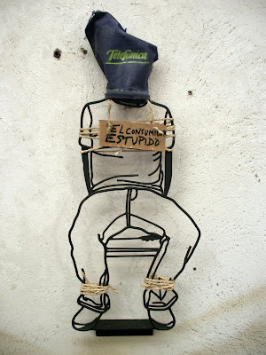 Hostage #1 The Stupid Consumer (El Consumidor Estupido) , Steel, Jute, Fabric, 55cm x 22cm, 2007
 Hostage #1 The Stupid Consumer (El Consumidor Estupido) , Steel, Jute, Fabric, 55cm x 22cm, 2007
Hostage #1 brings me to the second agenda i have while developing these series. Hostage #1 is a piece that developed when i reflected on how everyday citizens are often, through misinformation, clever marketing, half truths, simple oversight, under education and sometimes just sheer stupidity are duped into situations where they are legally bound to something that is not in their best interest. In a sense held hostage. My specific focus now is in Spain because that is my current experience. Here I feel there is no tradition of safeguarding consumer rights and it is well documented that Spain lags behind in opening up certain markets to 'real' competition. This maintains a sort of government approved monopoly where the consumer is held hostage to the whatever power happens to be in control in that particular industry and whatever price they value there product at. Recently the european union overstepped the spanish telecommunications regulatory commission and fined Telefonica, the local 'Grande' in telcom, over 150 million euros for what it saw as unfair market practices concerning the the provision of Bandwith to it's customers. That leaves alot to the imagination as to the links between Telefonica and the local regulatory commission in charge of monitoring it's practices.
Recently in the region of Catalunya, whose capital is Barcelona, after a fire in an electric substation vast areas of the city were left without light for days on end. It has come to light that the whole system is dangerously inadequate for the demands that are placed upon it and that the local power company could almost be considered criminally negligent in allowing the situation to degrade to such an extent. Hospitals, public transport, traffic signaling systems, etc. were all left without power and a series of flatbed generators had to be placed in strategic points across the city to serve as a makeshift solution. generators that emit more noise than legally allowed in public spaces as well as compromising the air quality as they are all diesel generators. One would think if they don't give you choice they should at least provide stability. Thousands of people and businesses were compromised to the point where the government had to step in and oblige compensation for those affected. On one side one could argue that perhaps prices need to be raised to maintain the upkeep of the system, on the other side one could argue for more transperency and truly effective regulatory commissions that provide the security and confidence that paying customers deserve. This work is by no means meant to devalue the experience of people who are forcibly and violently held beyond their will worldwide. It is meant to draw a strong parallel between such actions with those of organizations that have an obligation to provide basic necessities but through the application of what could be considered sinister business practices are responsible for the degradation of millions of peoples lives.
Recently in the region of Catalunya, whose capital is Barcelona, after a fire in an electric substation vast areas of the city were left without light for days on end. It has come to light that the whole system is dangerously inadequate for the demands that are placed upon it and that the local power company could almost be considered criminally negligent in allowing the situation to degrade to such an extent. Hospitals, public transport, traffic signaling systems, etc. were all left without power and a series of flatbed generators had to be placed in strategic points across the city to serve as a makeshift solution. generators that emit more noise than legally allowed in public spaces as well as compromising the air quality as they are all diesel generators. One would think if they don't give you choice they should at least provide stability. Thousands of people and businesses were compromised to the point where the government had to step in and oblige compensation for those affected. On one side one could argue that perhaps prices need to be raised to maintain the upkeep of the system, on the other side one could argue for more transperency and truly effective regulatory commissions that provide the security and confidence that paying customers deserve. This work is by no means meant to devalue the experience of people who are forcibly and violently held beyond their will worldwide. It is meant to draw a strong parallel between such actions with those of organizations that have an obligation to provide basic necessities but through the application of what could be considered sinister business practices are responsible for the degradation of millions of peoples lives.
Thursday, August 02, 2007
Sunday on the Terrace
 "Sunday on the Terrace", 350cm x 120cm, Steel, 2007
Recently I went to a brunch on the terrace of a friend of mine in the neighborhood of Barceloneta. These brunches are normally replete with a staggering mix of people from all over and are hosted by connector extraordinaire Sandy Brunner, an architect native of Zurich. I have been going to these brunches for a few years now and in fact one of these brunches a few years back also provided the source material for a drawing in steel of a group of sardines which Sandy now owns. Anyway at a certain point I began to note the variety of postures people were assuming while laying in two plastic reclining lawn chairs that were on the terrace. People were assuming the most relaxed and languid positions that I began to think that I might be able to do a piece involving the material. Out comes the camera.
 This is the first image that really made me think about the potential of using this material in a piece. It's a photo of a friend, Fery Rohrer, and it served as a point of departure for the creation of "Sunday on the Terrace". My desire with the piece was really to capture a completely normal moment and all the poetry inherent in it. Each individual posture is an incredibly complex equation which I believe can communicate alot about a persons current relationship to their surroundings. By doing four figures I have also created an imaginary dialogue which can actually be manipulated by changing the positions of the figures.
 This piece is also exhibited on Sandy Brunner's terrace. It seems that her terrace is a spot that I find inspiring.
Friday, May 25, 2007
Handwritten Text
 More than a long time ago, a friend approached me with the possibility of doing a piece for him. He and his wife both appreciate my work and he wanted to surprise her for her birthday with a piece. So we discussed a few ideas and thought it might be nice if I had a look at some material they had generated on their honeymoon in the greek isles to use as a point of departure. I looked at the material and after doing some preliminary drawings decided to focus on the text for starters with the possible incorporation of an image.
Hand written text is fascinating for me in the same way that a fingerprint is in that it inherently represents an individual.


This is a small sketch I did for my friend Christian Marti and his wife Sole when they bought the text piece. It was right after I did the "Forever" Heart. I am quite happy with it and thought that much larger might also be quite nice...
Wednesday, May 23, 2007
Going to the Chapel.....
 Heart, Steel, 160cm x 120, 1999
 Love, well at least the human heart as icon is an image that I have been busy with for a long time. In fact the image of the heart I have created has been one of the more popular pieces that I've ever done and has figured as a gift in at least three weddings and is displayed in two heart clinics in Holland as well as a handful of private residences. I have a lot of cariño or feelings for the image. Recently I was approached by a group of friends that were interested in buying a gift for a close friend of their's who was tying the knot. As time was a factor a lengthy design process was not an option and I told them that it would be much easier to work with an image or design that I already and tweak it to personalize it. I half jokingly said to them that it would be great to incorporate text as currently I'm working on another piece that involves text. That's when a slew of possibilities hit me. We agreed that the idea had potential and I agreed to do a couple mockups. The result is what you see below.

I wanted a really ornate and frilly font which I was able to track down online seeing as the ones I had on hand weren't quite baroque enough.
 Forever,Steel,158cm x 140cm, 2007
The result for me is an homage to classical tattoos from another era (although in researching the project I found that those classical themes are very much alive and present in contemporary tattoo design.

The finished piece in an interior.
And another....


Monday, April 02, 2007
Remote Control: MOCA Shanghai March 3rd - April 20th 2007

In Mid January I was notified by Thomas Charveriat that we had been invited by the curators, Ella Liao and Wennie Teo, of an exhibition at the Museum of Contemporary Art in Shanghai to exhibit two pieces that we had previously collaborated on, F2T and Light Activated Faces. For awhile I had been looking for a good enough excuse to get out to Shanghai and investigate the small empire that Thomas has created for himself there which includes his gallery Island6 Arts Center, this looked like the perfect opportunity.
On the 17th of February I boarded a Finnair flight to Helsinki where I would catch a connecting flight to Shanghai. The voyage went without a hitch and I arrived at Shanghai's Pudong Airport at 8am the morning of the 18th of February, coincidentally Chinese New Years (Year of the Pig). Little did I know as I waltzed through the almost deserted airport to the strains of Kenny G's Christmas album that this was going to wreak havoc on our work schedule as the vast majority of things were closed and people on vacation. I caught a cab and made my way down to Island6 which was to be our command control for the next month. Once there I began to meet the cast of characters that would take part in the process of realizing the works we were to show at the MOCA.
 Taxi drive from Pudong International Airport to Island 6 Arts Center
Arriving to Island 6 was a bit of gift because it's not very often that you can go to a foreign country and walk straight into a fully functional work environment. Granted the space we were working ins primary function is that of exhibition and office space not only for Island6 but also for Warehouse Studio, the brainchild Of Lucas and Olivia Gurdjian who would also be fundamental in the development of the visuals and elements of the sound for the projects exhibited in the MOCA. It was a bit tight but we made it work with a bit of patience and reorganizing.
The second day I was there we hit the ground running, this was to be the beginning of a marathon which not only involved the show at the MOCA but also pitching in and lending a hand in mounting the show Platform for Urban Investigation curated by Allard van Hoorn at Island 6 which inaugurated on the 10th of March.
The Place

Island 6 with the sunshine of Moganshan Lu 120 looming in the background. That's Thomas Charveriat, "Sunny" to his friends for his perpetual good moods. He's synonymous with Island 6. His sheer force of will is the driving force behind the whole operation and responsible for the realization of numerous works of art as well as whipping more than a few lazy artists into shape. Beware!
The Cast
Lucas and Olivia Gurdijan
As usual with such an undertaking it's important to be well organized and have a good group of people to provide support. We at least had a good group of people to provide support. Officially credited in the realization of the projects are myself and Thomas as well as Lucas and Olivia Gurdijan,

Super French Design couple Olivia and Lucas Gurdijan of Warehousestudio doing their Mac mind meld.
Yang Longhai
 Watch your dumplings!!! Longhai is the go to guy when your looking for something in the studio, always looking to help. His appetite for dumplings is almost as big as his appetite for english curse words. "Shitfuckman.... Shit.... Fuck... Man..." Need he say more?
Zou Shu Shu or Yan or Ian
 Ok I thought I was upbeat until I met this guy. Zou Shu makes me look like a Gitane chain smoking, Pernod swigging, black turtlneck wearing exitentialist. Oh and he's multi talented, in this project he rapped as well as was the closest thing to a visual identity our projects had not to mention his skills as a video editor and designer.
Scott Hess
Music and Sound Design
 Don't let the foto fool you it was taken at four in the morning when Scott is at his creative best. Scott did a great job of making Yan and my vocal tracks sound pretty damn good, In fact we are planning a tour of Finland in the summer. He's also the man behind turning Olivia and his own girlfriend into electronic temptresses, "Send me message....".
Behind the scenes are three people that that were indispensable:
Zhu Yu Mei
 Widely known as the Pearl of Shanghai but referred to affectionately as Julie, she works as Thomas' assistant in the gallery and shoulders the brunt of his maniacal behavior. She gets things done and proprietors have been known to close their shops when they see her coming on Bejing do Lu. Her negotiating skills are unrivaled.
Sebastiaan Hanssens

Sebby or just plain old workerslut#2, Gallery intern extraordinaire pictured here googling the alcohol content of Golden Harvest Imperial Quality Beer.
Olivier Verhaeghe de Naeyer
 workerslut#3, fruit of the loins of the french speaking belgian hinterland and patent holder of the famous Olivier "S" otherwise known as the Verhaeghe de Naeyer knot.
These last two poor slobs normally fell under my jurisdiction, yes me, King workerslut.
 Your Narrator, King Workerslut, a message to all you pretenders, one day I will come back and occupy my rightful place on the throne of all workersluts! Got that?
No seriously, without their support, good humor and willingness to even do the most menial of tasks the project would have been much more difficult. At 4am during a 16 hour workday it's good to have as many smiling faces and as many bottles of Golden Harvest Imperial Quality Beer around as possible.
Island 6 as an institution shouldered the production costs which I am sure was no small amount as well as my palatial housing set up pictured below.
 The Suite of Blissful yet Short Dreams at Chez Charveriat, not to be confused with the Beware All Ye of Feminine Persuasion who Enter Here Suite or the Funny Noises In the Morning Suite. Note the ever present bottle of Golden Harvest Imperial Quality Beer in the lower left hand corner. This precious elixir has the magical powers of endowing one with eternal sobriety.
Also we had a variety of other folks that pitched in too many to mention all of them but the ones below stuck out.
Da Boyz

These are the resident handymen of the gallery. These guys are brillant, I rolled with them to the museum for the installation as you see pictured here. These fellas know how to work hard.
Jack

A buddy of Scott's that came in a few evenings with a bright disposition and eager to help. A ceramicist by trade.
The Computer Controlled Router

The unsung hero of the whole affair, how i miss the howling whir of her voice for hours on end. Can anyone say calibrate?
The Works
New versions of F2T and Light Activated Faces (here to forward referred to as LAF) were in order, out with the old and in with the new.


I had brought some of the previously exisiting technology for the projects with me in my suitcase. Some of the elements Thomas had already had realized before my arrival such as new boxes for the light activated faces, each image would have it's own box now where as before we had larger boxes of nine panels each.

Okay as you can imagine I was more than a bit nervous taking this thing through customs. Does it look like art to you?
The process leading up to the exhibit was one of accelerated investigation. We actually did the two projects in a very short period of time. The shortage of time caused us to work with a very short narrow margin of error which can be a very bad thing when working with electronics. The first week was consumed with epic journeys to Bejing Do Lu, which is the hardware district of Shanghai. If your into tools and stuff as I am this was pretty exciting, actually that's an understatement it's like going to tool mecca only you can negotiate the price. These days we literally spent between 4 and 6 hours scouring shops for screws, springs, electronic components , guides, countersinks, solenoids, motors etc. etc. etc.


couldn't begin to explain the variety of shops we saw during that week but at the end I'll tell you I was ready for a break. Thomas has an incredible ability to maintain the appearance that he is absolutely fascinated in the pursuit of just the right screw or the guide with just the right amount of resistance for hours and hours.
Eons after my patience had run out he still had the eyes of a child in a toy store egging me on to go back to the shop where we saw that one component.
To Dibond or not to Dibond
LAF was in this particular instance not as complicated as F2T. With F2T we had made the decision to use a material called Dibond which is composed of two thin sheets of aluminium that sandwich a layer of green plastic. Working with the computer controlled router (CCR), we could engrave the material which would leave the dark plastic exposed and with the aluminium create a very attractive contrast. We did a couple test trials. Alas not enough. Two nights before the load in of the exhibition we did the final cut of one of the pices, previously we had only done outlines. Without the surface being reinforced by the aluminium the whole thing began to bow up in a manner that would make it impossible to work with.
 This presented us with quite a dilemna with only 48 hours before load in. Hence on the fly Thomas suggested using the same material that we were using as a support for the whole project which was 3cm thick transparent plexiglass. So we would have one sheet(about 12cm x 180cm)as a support then the other pieces (arms, head/torso and legs) mounted on top with a system of guides, solenoids, washer bearings and pulleys to control the movement. The drawings of the respective figures would be engraved into the surface of the Plexi which then turns a milky white presenting the viewer with ghost like apparitions.
 We had three panels, the central figure of the rapper shown on the left, the choir which was composed of three female figures in a somewhat blurry image on the right, and the boom box during the mounting process below.
 Installing the day of the show. Documentation by Warehouse Studio
Whilst we were busy downstairs Lucas Gurdijan was upstairs in the room we had for the LAF Installation.

In this particular version we had changed all the sounds and images from the previous versions. Below you have the panels we used. Photo Documentation: Olivier Verhaeghe

In the end this is how the piece looked installed, LAF is a wonderfully accessible piece that brings out people's creative sides and normally a smile to there face.

Photo Documentation: Olivier Verhaeghe
Subscribe to:
Posts (Atom)